Blog 5.2 – Steinway & Sons Logo

Image result for steinway piano logo

If it’s a brand logo (design):

  1. Describe in detail the image, and why you believe the company selected the brand elements (color, size, layout, character, etc.) that they did. Your analysis should include a brief description of the competitors and how your selected brand logo compares.  In other words, why did they choose the brand elements that they did.  

Steinway & Sons is piano manufacturing comply that make some of the highest quality pianos and is critically acclaimed by pianist across the world. In the logo, we see that there are a few interesting characteristics. First, the logo part of it is a beautiful and elegant design with references to sheet music that indicates it is a brand affiliated with music. The elegant look to the logo makes great sense as pianos are often associated with beauty and elegance, particularly Steinway & Sons pianos. Below the main logo, we see the company name written in strong bold black letters. This font and style gives off a feel of luxury and quality. Steinway & Sons also is know to use their logo but in a gold color, further more conveying the message of value and luxury. This is not surprising when taking into consideration that these pianos cost more than a new car, and sometimes even a house.

Image result for steinway piano beautiful concert hall

When compared to their competitors, we often see that Steinway & Sons logo is much more elegant than most other logos. This would account for the fact that the company wants to communicate their prestige and beauty over their competitors.

Image result for yamaha piano logo
Yamaha, one of the largest piano manufactures, has a much less striking and beautiful logo when compared to Steinway & Sons
  1. Describe the target market (ie. what segments are being targeted)?  How do you know this is the target market? Did the company make good decisions to reach the target market?

The target market of Steinway & Sons is pianists who want an extremely high quality instrument and often are willing to pay extremely high prices in order to do so. This would make sense seeing as how S&S pianos are both very high quality and very expensive. S&S also knows that people within their target market often desire their possessions to look luxurious and prestigious. Their logo perfectly encapsulates that is sure to look stunning anywhere from a house living room to Carnegie Hall.

  1. Does it work? Why or why not? Any general observations?

I believe that the logo perfectly conveys the type of company that S&S stands for. Between the musical inspired logo and the beautiful and strong design of the letters, it is easy to tell that the logo is for an extremely high ranked piano company. Personally, I’ve noticed that any time a S&S piano is being used, it is almost always in a very exclusive or highly funded concert or event. This lies perfectly in place with their target audience and shows that the company has a strong understanding of their market.

Blog 5.1 – Ultimate Guitar Logo

Related image

 If it’s a brand logo (design):

  1. Describe in detail the image, and why you believe the company selected the brand elements (color, size, layout, character, etc.) that they did. Your analysis should include a brief description of the competitors and how your selected brand logo compares.  In other words, why did they choose the brand elements that they did.  

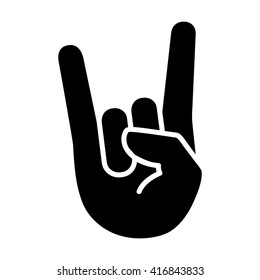
UltimateGuitar.com, or Ultimate Guitar, is an online website that has over 1 million guitar tabs (an easier alternative to sheet music) and chord charts for almost every song that you can think of. Most tabs are free, and the majority of the brand’s income comes from ads within the website. Guitarists use these tabs and chord charts to learn their favorite songs and guitar parts. The logo for Ultimate Guitar is a very cool logo that does a great job representing what the website is. First off, we notice that the background is in the shape of a yellow guitar pick. This helps to instantly show, even to people that are not familiar with the brand, that the logo is guitar related. Also, yellow is associated with creativity, which makes sense seeing as how musical instruments require creativity. We then see a letter “G” standing for guitar to further convey the message of being guitar related. One of my favorite parts of this logo is that the “G” is not just a plain “G”, rather, it is sharp and angular to give a sort of rock and roll vibe often associated with guitar. Further more, the “G” in the logo has horns on it that make the “G” look uncoincidentally like a “rock on” hand gesture. Just from browsing the home page of Ultimate Guitar, I noticed that the genre of rock has drastically more number of tabs and chords than any other genre. It would make sense that Ultimate Guitar has their logo cater to the largest target market of their customers, being rock guitarists.

Image result for rock on hands

In the image above, we can see that the “rock on” hand gesture shares similarities to the Ultimate Guitar logo.

  1. Describe the target market (ie. what segments are being targeted)?  How do you know this is the target market? Did the company make good decisions to reach the target market?

The target market of Ultimate Guitar is guitar players who are looking for an online community to find tabs or like minded guitarists to discuss guitar related topics on the forums. As mentioned before, it looks that in particular, Ultimate Guitar is targeting especially rock guitarists. Of course there are tabs for all genres, but rock seems to be the focus. This being said, I believe that the company made a great decision on designing their logo by incorporating both a guitar pick and a clever nod to the classic “rock on” hand gesture heavily associated with rock. All of these aspects combined help to create a great logo that perfectly suits the brand and its audience.

  1. Does it work? Why or why not? Any general observations?

It is always hard to tell if a logo is “working” or not. However, what I am certain of is that the logo does a great job of communicating what type of website it is without the use of even a single word. Even to guitarists who are completely unfamiliar with the website, if they see the logo, they will most likely know that it is a guitar related website, which in turn could draw more traffic to the website out of curiosity and therefore increase the user base.

Blog 4.2 – The concept behind Spotify’s one month free trial

Related image

If it’s an advertisement:

  1. Describe in detail how the business implemented the four P’s to add value and/or promote the product or service. 

This concept of a free trial isn’t necessarily an advertisement, but more of a promotional strategy that I will discuss. Spotify is a music streaming service that gives the user access to essentially any song on demand at any time. You pay a monthly fee and then have access to the entire service. Something interesting that Spotify offers is a full one month free trial to anyone who has not used their service before. No catch, no strings attached, just one month free, as simple as that. The “p” that this strategy fits into is most likely the promotional “p”. By giving users a free trial, they are able to promote their business by allowing many people to be offered a free service, who would want to turn down a free service? The goal of this is to let users get a taste of what having a Spotify membership is like temporarily. Spotify hopes that after the trail is over, you will se the value of having a membership and want to continue your membership by paying the monthly fee thus giving Spotify more business. What is so genius about this concept is that nobody really loses. Because Spotify is an electronic service, their cost to run the business is really the same irregardless of how many users they have. Although I’m sure this is not true with exponential user growth, I imagine that the cost to run Spotify is the same whether they have a millions users, or a million and one users. Therefore, Spotify is not losing money by offering free trials to potential customers. However, they are drastically increasing their chances of people eventually deciding to use their paid subscription by giving people the chance to try it for themselves.

Image result for spotify free trial 30 days
  1. Describe the target market (ie. what segments are being targeted)?  How do you know this is the target market? Did the company make good decisions to reach the target market?

The target market of Spotify is people who are looking for an alternative to outright purchasing musing or simply someone who is looking for a streaming service in addition to owning personal music. The market of streaming music services has exploded in the past years and the majority of young music listeners chose streaming services over other forms of music consumption. I believe this promotional strategy is great decision as Spotify really has nothing to lose and will mostly gain users as a direct result of this promotional strategy. Even if only one out of a hundred free trial users decide to pay for a subscription, Spotify is still making money.

  1. Does it work? Why or why not? Any general observations?

I personally believe that this strategy works extremely well. My personal experience is that I myself tried the free trial, just to see if I liked it. After my one month free, I enjoyed it enough that I decided to join the paid subscription service. I am a strong believer that a good product or service will sell itself if it truly meets consumers needs in all aspects. By giving users a free trial to Spotify, which I believe is a great product that meets consumers needs, Spotify is able to greatly increase their paid user base through a very smart promotional program.

Blog 4.1 – Beats by Dre promotional photo

Image result for beats by dre ad

If it’s an advertisement:

  1. Describe in detail how the business implemented the four P’s to add value and/or promote the product or service. 

This is a promotional photo made by famous headphone company Beats by Dre. Beats is attempting to add value to their products and promote their brand by using famous influencers to represent and promote their line of wireless headphones. Beats headphones have almost become just as fashionable as they are functional, and Beats knows this fact. The ad is almost attempting to make their headphones look like fashion accessories rather than simply your everyday headphones. Something important to note is that all the “models” promoting the headphones are very famous influencers within pop culture (Karlie Kloss, Liza Koshy, Pharrell Williams). By using these famous influencers, Beats is able to best reach their target market of people who want to be seen with the latest and most trendy fashion accessories and technology. This advertisement focuses almost entirely “promotion” of the four Ps. This is evident as the ad shows no information on why the headphones are a great product, where to buy them, or even how much they cost. The ad strictly is focusing on promoting their product by using celebrity influencers in order to cause people to view their product as more desirable.

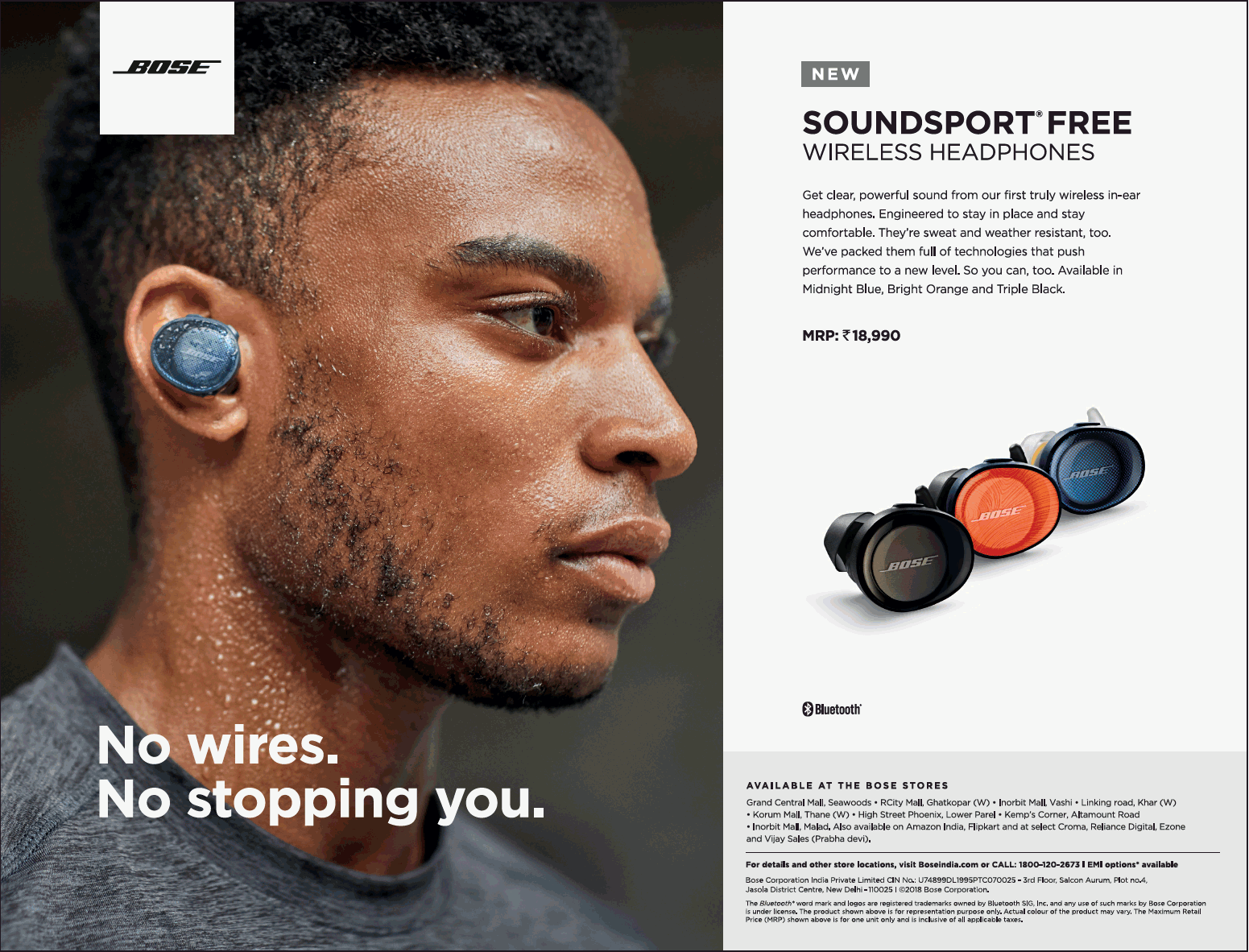
A quick comparison to their competitors ads show that Bose in particular takes a different approach with this headphone promotion. This ad, also for wireless headphones, is sure to give information on why the headphone quality is good and includes the price. For this reasons, the Bose ad focuses on the product and price sections of the four Ps.

  1. Describe the target market (ie. what segments are being targeted)?  How do you know this is the target market? Did the company make good decisions to reach the target market?

The target market of the Beats ad is people who are in the market for wireless headphones, but also value fashion and almost a social status. I believe this is the target market because the ad displays no information as to why the products themself are valuable, the price, or where to buy them. However, the ad does attempt to ad value by using influencers to promote the headphones and subsequently people who admire these celebrities will feel more inclined to purchase these. I believe the company did make a good decision by creating this promotional image. Beats knows their target market very well, and they were sure to create an ad that is aimed directly at their target market. In today’s age, many people, particularly the millennial generation, are obsessed with becoming their own “celebrity”. Millennials follow hundreds of influences on social media and are constantly aiming to replicate what they see. By using these same famous influencers in a promotional ad, Beats is able to get their target market to view their product as desirable and trendy within pop culture.

  1. Does it work? Why or why not? Any general observations?

Personally, I believe that this is an effective promotional image. It is simple yet straight forward. There is really only one message trying to be conveyed, and that is that Beats headphones are cool. The ad has influencers with beautiful lighting and carefully selected clothes that show that Beats headphones are more than just technology, they are a fashion accessory.

Blog 3.2 – PDP Eric Hernandez snare drum advertisement

If it’s an advertisement:

  1. Describe in detail how the business implemented the four P’s to add value and/or promote the product or service. 

This video advertisement is made by PDP/DW (drum company) in order to promote and advertise their Eric Hernandez signature snare. By far the most utilized aspect of marketing we see in this video is the “P’ of promotion. Eric Hernandez, the drummer for Bruno Mars, is clearly being used as a celebrity in order to cause people to view the product as more valuable and desirable. Many drummers admire Eric Hernandez and Bruno Mars, making Eric a great person to help promote the sale of this particular signature snare.

In addition to utilizing promotion from a famous drummer, PDP/DW is sure to make the video both look and sound amazing. The carefully chosen lighting mixed with the beautiful looking drum kit and editing help to add value to the snare by making it look as visually appealing as possible. Also, the snare, and rest of the drum kit for that matter, sound absolutely amazing. After all, it is a musical instrument, so the way it sounds is extremely important to potential customers. By using what I’m sure are extremely high quality microphones and proper sound mixing, PDP/DW ensures that the product they are selling sounds as good as possible, causing potential customers to want to purchase their product.

  1. Describe the target market (ie. what segments are being targeted)?  How do you know this is the target market? Did the company make good decisions to reach the target market?

The target market here is of course drummers who are in the market for a new snare drum. However, more specifically, based on the type of snare drum this is, PDP/DW is targeting drummers looking for a snare that best suits funk music and pop. This makes complete sense to use Eric Hernandez, one of the biggest names within this genre of music, to endorse the product. It would not make as much sense to have a heavy metal drummer try to advertise a snare opposite to the particular market in which the product is intended for. I believe by using Eric’s celebrity, PDP/DW made a great choice to allow an influencer to help sell their product to as many people as possible.

  1. Does it work? Why or why not? Any general observations?

In my opinion based on just a few general observations, this advertisement is very effective toward the target market. Personally, after watching the video, I truly felt that I would like to have this particular product. In addition to the advertisement’s personal effect on me, a quick browsing of the comments section reveals that many other people think very positively of the product and certainly this advertisement has been responsible for a number of sales of the snare drum.

About

Brief Testimony:

Growing up as the child of a Christian pastor, I never really had a moment in which I made a drastic switch to Christianity. However, as I grew up I of course started to learn more and more about Jesus and was able to make my Christianity my own rather than just tradition of my Family.

About me: 

My name is Drew Stamps and I am a freshman at NCU. I am currently studying marketing. I love music and have played drums for about 5 years. I have spent the majority of my teenage years living in both Mozambique and Portugal as my parents are currently missionaries. 

About my future

Although I am not certain what God has in store for my future, I am certain that the skills and experiences I gain at NCU will prepare me for a successful future. As marketing major, I of course plan to do something within the field, however I have no specifics plans as of right now.

What I anticipate from this class: 

I hope to not only gain a genuine understanding of marketing, but also to ignite a natural passion of mine toward marketing as a whole. I already can realize that marketing is naturally interesting to me. After gaining knowledge and experience from this class, I am sure that my passion will only continue to grow.

Blog 3.1 – Vic Firth logo


if it’s a brand logo (design):

  1. Describe in detail the image, and why you believe the company selected the brand elements (color, size, layout, character, etc.) that they did. Your analysis should include a brief description of the competitors and how your selected brand logo compares.  In other words, why did they choose the brand elements that they did.  

Vic Firth is a drum company that specializes in drum sticks. The logo of Vic Firth is fairly simple, yet has aspects that are carefully planned in order to best represent the company. The logo is not very complex, which stands in line with the fact that drum sticks in essence are rather simple. The sharp edges of the letters and the small red dots of the “i”s help to convey a message of power and energy, two things that are often associated with drumming.

Image result for vic firth drumsticks

Something interesting to notice is that all Vic Firth drum sticks have a signature American Flag printed on to them (as shown in photo above). This is to signify to customers that Vic Firth is an American brand. There could be a few potential reasons as to why Vic Firth would like to advertise this fact. One of those reasons, is that perhaps many drummers that are themselves American want to support an American company themselves rather than a foreign company. Another reason is that many people could perceive an American company as a company that makes quality products. These are both logical reasons as to why Vic Firth decides to put their signature American flag on the drum sticks. No other major drum stick company includes the American flag on their drumsticks, giving Vic Firth a standout trait that they hold over their competitors.

  1. Describe the target market (ie. what segments are being targeted)?  How do you know this is the target market? Did the company make good decisions to reach the target market?

The target market of Vic Firth is obviously drummers. This is easy to know as there are basically no uses for drum sticks other than drumming, hence the name. Although the logo is very simple, I believe this was done on purpose as drum sticks themself are also very simply. The fact that an American flag is included on all drumsticks by them may show that they are targeting drummers who have a greater appreciation of heritage and history. Just from my personal experience, I have noticed that older drummers or drummers of older music styles prefer to use Vic Firth drum sticks. This could be a direct correlation to Vic Firth having a brand image and logo that symbolizes heritage and history through the American flag. By choosing a logo that is relevant to the product they are selling, Vic Firth is able to communicate to its customers that they share the same values as their customers thus encouraging consumers to chose their product over others.

  1. Does it work? Why or why not? Any general observations?

Although it is hard to judge simply from logic whether a logo as simple as this is effective, Vic Firth is one of the biggest names in drum sticks. This means that as a company, they have successfully taken a large part of the market share within the drum stick industry. Their logo, as simply as it may be, surely played a part in order to be instantly recognizable and therefore allow the company to become what it is today.

Blog 2.2 – Martin Guitars brand logo

Image result for martin guitar brand logo

If it’s a brand logo (design):

  1. Describe in detail the image, and why you believe the company selected the brand elements (color, size, layout, character, etc.) that they did. Your analysis should include a brief description of the competitors and how your selected brand logo compares.  In other words, why did they choose the brand elements that they did.  

Martin & Co. is a high quality guitar brand that is most know for beautiful and great sounding acoustic guitars. The logo, as shown above, has a few characteristics that I believe help to cater to their target audience. For starters, The font is very elegant and classic. Elegant and classic are two words that go hand in hand with Martin guitars and this is no doubt a coincidence. The company is trying to convey what kind of guitar company they are based solely on the logo. Something else interesting to note is that the logo is sure to include the year in which the company was established. In this particular case Martin & Co. was established in 1833. This shows that the company has been making guitar for nearly 200 years. This information conveys to customers that the company is extremely experienced and this often times means that the products are very well made. This is very true in the case of Martin guitars.

Interestingly enough, Martin & Co.’s logo is the only one within its main competitors to include the date in which it was established. A quick Google search revealed that Martin is in fact the oldest guitar company when compared to its to main competitors (Fender, Gibson, Taylor etc.). This is, in a sense, a completive edge that Martin has over their competition. By adding their established date in their logo, they are sure to market this fact as best as they can.

As shown below, Martin is the only company compared to its main competitors to include the established date within their logo.

Image result for martin guitar brand logo
  1. Describe the target market (ie. what segments are being targeted)?  How do you know this is the target market? Did the company make good decisions to reach the target market?

The target market of Martin & Co. is guitar players who have a high budget to spend on guitars of exceptional quality. It is evident that this is their target market based on the fact that the majority of their guitars cost upward of $1000. Their logo emanates quality and luxury based on the font and included established date. I believe this was a great decision in order to best reach their target audience, specifically the fact that the logo includes the established date, which implies that the company has been around for a long time and has strong experience in making quality guitars.

  1. Does it work? Why or why not? Any general observations?

My personal observations are that this logo does in fact work to convey the brand’s identity to its customers. The logo gives off a feeling of heritage and experience, something that Martin guitars are well known for. Although I do not own a Martin guitar, I know that if given the ability they would be among the very top of my choices for a quality acoustic guitar.

Blog 2.1 – Guitar Center Store Layout

Trip to Guitar Center

Image result for guitar center
  1. Describe in detail the servisescape.  Why did they select this specific layout, color scheme, etc.?  What does it convey to the consumer?  How does it align with their brand perception?

Earlier this week, me and a few friends visited a local Guitar Center (musical instrument store). Something interesting that I noted was that the store layout was put together in a very thought out and strategic way. As soon as you walked in, there was stage lighting and sound equipment on both sides of you for sale. It wasn’t until you got all the way to the back of the store that you would be in the guitar section. The entire back wall was filled with hanging guitars for sale on a rustic wooden backdrop with lighting that made the guitars look beautiful. The reason that I suspect, and have read, that the guitars are at the back, is to draw traffic through the whole store. If I had to guess, the stage lighting and sound equipment at the front of the store is nowhere near as common of a purchase as the guitars and accessories. By placing the guitars at the back, the store ensures that you must walk past all other products in order to get to the guitars. As far as the well lit rustic wooden wall that the guitars were hanging on, I believe this is to deliver perceived value to potential customers. When put in an elegant and beautiful setting, the guitars naturally have more perceived value and I would imagine that this has a direct correlation to impulse sales at this specific location.

Describe the target market (ie. what segments are being targeted)?  How do you know this is the target market? Did the company make good decisions to reach the target market?

The target market for Guitar Center is almost certainly male guitar players. A quick Google search shows that roughly 90% of all guitar players are male. Based on this information, I believe it is fair to assume that this is the targeted market of Guitar Center. This target market of males would account for the rustic look of the guitar wall that has more a masculine and raw look to it. By curating their store layout and design to best suit their target market, They ensure that sales are as high as possible.

Does it work? Why or why not? Any general observations?

I believe that this store layout and design is very effective. Although I didn’t purchase a guitar that day, I do know that the majority of my time was spent in the guitar section. Also, because of the layout, I was forced to walk past the stage lighting section. Just out of curiosity I took a quick look at what there was to see. I most likely never would have looked at the stage lighting if it were not in my walking path, which is exactly what the store owners want.