Blog 10.2 – Zildjian Cymbal Logo

Image result for zildjian logo

 If it’s a brand logo (design):

  1. Describe in detail the image, and why you believe the company selected the brand elements (color, size, layout, character, etc.) that they did. Your analysis should include a brief description of the competitors and how your selected brand logo compares.  In other words, why did they choose the brand elements that they did.  

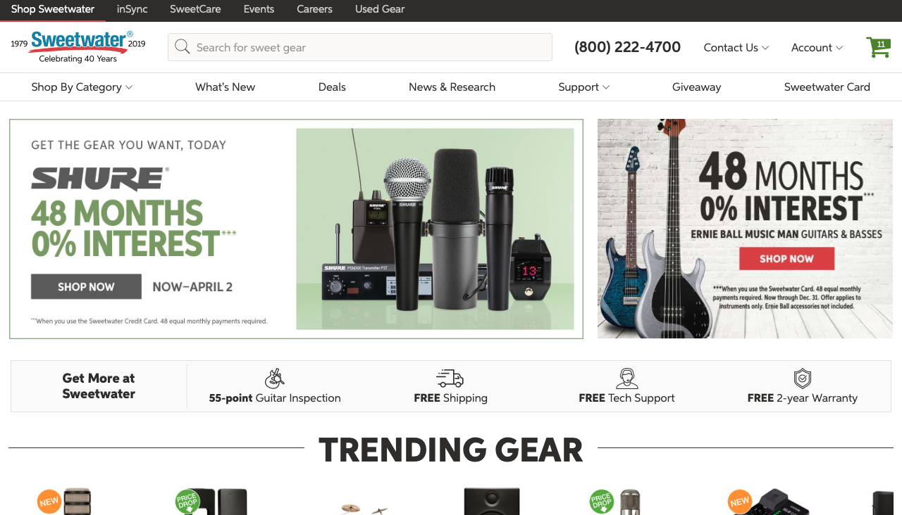
Zildjian (Pronounced zil-jin) is an American cymbal company that was founded in Constantinople nearly 400 years ago. Zildjian is known to make some of the best cymbals and is highly regarded within the drum and percussion industry as a great manufacturer of cymbals. The logo is simply the company name written in black letters. We also see that the font is very foreign most likely inspired by the company’s old and foreign heritage. Also, this may seem a little simple to note, but the logo is honestly just cool looking. It actually plays a large role in giving Zildjian cymbals a unique look that is instantly recognizable on all their cymbals.

Image result for zildjian cymbal wallpaper

One of Zildjian’s main competitors is Sabian, who is also a very large cymbal manufacturer. We notice that Sabian’s logo is slightly more modern looking and does not seem to represent a heritage as much as the Zildjian logo is able to convey.

Image result for sabian logo
  1. Describe the target market (ie. what segments are being targeted)?  How do you know this is the target market? Did the company make good decisions to reach the target market?

The target market of Zildjian is drummers or percussionists who are in the market for cymbals. The majority of their target market is drummers, but they also have a presence in marching bands and other percussion type bands. The design of the logo by itself honestly is not too vital to the brand, as it does not imply what kind of product it is, or even any information at all. Rather, I think the Zildjian logo is a great example of how a logo can grow in reputation to represent something other than just a brand. Zildjian cymbals are not simply known as just another cymbal brand in the drumming and percussion community, but known as some of the best crafted cymbals available.

  1. Does it work? Why or why not? Any general observations?

I think that without already knowing anything about the brand, the logo is really nothing too special. But thanks to the reputation Zildjian has made for themselves, the logo has become something that is very respected among musicians. This being said, I believe that the logo is a very valuable part of Zildjian’s company and works very well at accomplishing a symbol (pun intended) that not only simply has the company name, but also a deeper meaning behind the logo itself.

Blog 10.1 – Why Fender Guitars owns Squier.

This concept does not fall into any of the categories as given in the syllabus, but the same concepts apply as this is a promotional strategy.

Image result for fender and squier strat next to each other

Fender guitars is an American guitar manufacture famous for their iconic designs and well crafted instruments. Fender owns and have formed another company by the name of Squier. Squier shares the same designs with Fender and is owned and operated by Fender. So if they are so similar, why does Fender own Squier? Fender is a very respected brand known for making great guitars. As you may expect from a great guitars, the prices are quite expensive. If fender wanted to make cheaper guitars to reach a larger market, they would tarnish their brand reputation as solely a high quality guitar company. Instead, Fender makes Squier guitars at a much lower price in order to reach more of the market. By doing this under a different brand name, Fender is able to hold on to their high brand reputation while simultaneous hitting a lower price market with another brand. This strategy is a very strong promotional tactic that is very effective. Not only does it widen Fender’s market, it also keeps the legacy and reputation of Fender held high.

Image result for audi lamborghini logo

We actually see similar concepts to this more often than you may think in business. For example, many people may not know that the German car company Audi also owns Lamborghini. Audi chooses to make their highest performance cars strictly as Lamborghini in order for Audi to sell a wider range of cars and keep the reputation of Lamborghini as strictly performance. Lamborghini would lose a lot of status if they made sedans and SUV’s that were driven by soccer moms and middle school teachers. Instead, Audi chooses to build these more practical cars under their own name in order to maintain Lamborghini’s status and heritage.

  1. Describe the target market (ie. what segments are being targeted)?  How do you know this is the target market? Did the company make good decisions to reach the target market?

Back to guitars. The target market of Fender and Squier are both different, which is why owning both companies is such a brilliant idea. Fender’s target market is guitarists who are in search of a well made guitar that are willing to spend a fairly large amount. Squier, however, targets guitarists or new guitarists who are just getting started or staying on a budget. What is so valuable about the companies being related is that if a new guitarist is a fan of Fender but isn’t quite ready to purchase an expensive guitar, he/she can purchase a Squier guitar and still get a guitar that looks and behaves similar to a Fender guitar. This smart business decision gives Fender/Squier a large target market and puts them at a dangerous place to their competition within the market.

  1. Does it work? Why or why not? Any general observations?

I believe this strategy works extremely well. As a matter of fact, the Squier Stratocaster has become one of if not the most common first guitar for many players, including myself. Also, if a person who starts with or owns a Squier guitar decides to upgrade, they may be very likely to upgrade to a Fender because they have learned to love and enjoy playing their similar Squier. This allows Fender/Squier to not only attract multiple markets, but also lock their customers into their brands when they are ready to change guitars.

Blog 9.2 – Paul Reed Smith Guitar Logo

If it’s a brand logo (design):

  1. Describe in detail the image, and why you believe the company selected the brand elements (color, size, layout, character, etc.) that they did. Your analysis should include a brief description of the competitors and how your selected brand logo compares.  In other words, why did they choose the brand elements that they did.  
Image result for prs guitar logo

Paul Reed Smith guitars, commonly known as solely PRS guitars, is an American guitar company known for high quality hand-made guitars. The logo’s main image in a large black font is the common company acronym “PRS”. After that, we see the founder’s name written in all caps in a fairly large font to the right of the company name. Finally, we see that the term guitars is written underneath the logo in a font different to the others used in the logo. This helps to instantly let people know that PRS is a guitar company simply by viewing the logo. The logo also incorporates three horizontal lines segmenting the logo to add a streamline and aesthetic look. Paul Smith is a renowned guitar craftsman, so it makes sense that the company include his name in bold letters right in the logo. This name adds a sense of pride and craftsmanship to the company that helps contribute to a feeling of quality. It is common for guitar companies to be named after their founder, but it is usually only the last name. PRS is one of the only guitar companies that is sure to include the full name, even the middle, of the founder of the company. This shows that the company takes great pride in their founder and gives them a unique and competitive edge over other guitar manufactures in the market.

  1. Describe the target market (ie. what segments are being targeted)?  How do you know this is the target market? Did the company make good decisions to reach the target market?

The target market for PRS is guitarists who are in the market for a guitar, particularly a high quality and well made one. This is clearly the target market as these high quality guitars are essentially the only products that PRS makes. By using a professional looking logo with their founder’s name prominently visible in the logo, I think PRS does a great job of communicating value and quality to their customers. Additionally, the association with Paul Reed Smith as the founder helps to give a personal feeling to the company that genuinely cares about making quality products.

Image result for beautiful prs guitars

Above we see a showroom of PRS’s famous handcrafted high quality guitars.

  1. Does it work? Why or why not? Any general observations?

I personally believe the logo works very well. Perhaps it is my bias of knowing the quality of PRS guitars, but every time I see the logo, the thought of quality and beautifully crafted guitars is in my head. The logo is very unique to others within the market in that the name is solely the complete name of the founder. This helps to show that company is not only proud of what they make, but most likely will stand behind their products on a personal level.

Blog 9.1 – Alclair Logo

Image result for alclair logo

If it’s a brand logo (design):

  1. Describe in detail the image, and why you believe the company selected the brand elements (color, size, layout, character, etc.) that they did. Your analysis should include a brief description of the competitors and how your selected brand logo compares.  In other words, why did they choose the brand elements that they did.  

Alclair is a customer in-ear monitors manufacturer from Minnesota that creates high quality custom in-ear monitors. If you are unfamiliar with in-ear monitors, just think fancy custom earbuds designed for live performing musicians so that they can hear their own requested sound mix. In the logo of Alclair, we see that the company name is written in minimalistic letters with an artistic representation through a splash of blue written in the “C” of the logo. This “C” with a blue circle inside of it is also often used as a more simplistic logo of the company. Additionally, we see that under the company logo is the term “handcrafted in-ear monitors”. The simplistic logo with a tasteful use of color helps to give off a feeling of both composure and artistic expression. These are both things that many live musicians strive for, so it makes sense that Alclair would try to convey these ideas through their logo. Furthermore, the term “handcrafted in-ear monitors” easily allows potential customers to know what kind of company Alclair is. Also, by using the description of handcrafted, Alclair is able to convey a sense of quality and value by the association that handcrafted goods are usually of extremely high quality. I believe that specifically stating that they are handcrafted in the logo is a great decision because Alclair is one of few in-ear monitors manufacturers that are completely handcrafted. This gives them an obvious competitive edge over their competition.

Image result for artists using in ear monitors

Above we see solo vocal artists Ariana Grande using in-ear monitors (non Alclair) for her live performance.

  1. Describe the target market (ie. what segments are being targeted)?  How do you know this is the target market? Did the company make good decisions to reach the target market?

The target market of Alclair is performing musicians in need of or in the market for custom in ear monitors. This is clearly the market because musicians are almost exclusively the only people who use in-ear monitors. I believe Alclair made great decisions in formatting and creating their logo. First, the overall feeling of professionalism and art given off by the logo is a great example of how a simple logo can inspire an emotion in someone. Additionally, the mention of the handcrafted aspect of the company helps to give customers a sense of quality and give the company a competitive edge over their direct competition. Through all of the aspects combined in the logo, Alclair is able to affectively communicate value and quality to their customers all through the use of a small logo.

  1. Does it work? Why or why not? Any general observations?

I believe that the logo works very well at communicating exactly what it should. Not only does it clearly state what the brand is, but additionally gives off a sense of value and quality to its potential customers. Both of these things help to increase sales and grown the company.

Image result for alclair in ear monitors

Blog 8.2 – Why Stores Play Music for Their Customers


This category does not fit as an advertisement, band logo, or store layout, however it is still a valuable way of marketing related to music.

Usually, when you go shopping at a mall, the store your in will play background music. You may or may not even notice it, however it will always be subconscious running through your brain. There has been a lot of research done about the affect music psychologically has on you while shopping. However, ultimately it is there in order to make you purchase products. While shopping with music in the background, you are less likely to get bored while looking around and this may cause you to spend more time in the store instead of quickly losing interest and leaving. Also, studies have shown that high energy and upbeat music encourages purchases by psychologically, and usually unknwoningly, affecting customers. Additionally, niche stores can play music that caters specifally to their target market allowing customers to feel more welcome and at home. For example, Hot Topic may play punk rock or metal, whereas a shoe store specializing in hype and fads may play rap or popular hits.

Describe the target market (ie. what segments are being targeted)?  How do you know this is the target market? Did the company make good decisions to reach the target market?

The target market of each store changes drastically from store to store. However, as mentioned before, each store is able to play music that is aimed specifaclly at their target audiance. This will ultimately lead to better customer engagement and higher sales within the specific retail location.

Does it work? Why or why not? Any general observations?

I believe that this strategy is an extremely effective way of increasing sales in stores. Not only is it easy to incorporate, but the expense is extrenely low. That being said, there has been some debate about streaming services used in stores that raise issues of copyright and use of the streaming service, but that’s a complex topic for another discussion. Ultimately, playing music in a store accomplishes the goal of increasing customer enjoyment, the time they spend in the store, and in the end the amount of money spent.

Blog 8.1 – Marshall Amplification Logo

If it’s a brand logo (design):• Describe in detail the image, and why you believe the company selected the brand elements (color, size, layout, character, etc.) that they did. Your analysis should include a brief description of the competitors and how your selected brand logo compares.  In other words, why did they choose the brand elements that they did.  

Marshall Amplfication, usually known by just Marshall, is a company that specializes in guitar amps and heads. They are some of the most well known and highly regarded guitar amps of all time. The logo is fairly simply, with only lettering and fonts to distinguish the logo. First off, we see that the word “Marshall” is written in white letters in a cursive font. Sometimes the logo will be in black letters, but it is white when printed on the guitar amps in order to contrast the black color of the amps. The reasoning for the cursive font perhaps could be because Marshall is a company that has been around for a while, so there was no need to have a more eye catching logo to stand out against the competition. However, over time as Marshall has grown in reputation, the cursive letters help to give a feel of heritage and age to the company that a more modern logo would lack. Additionally, in some iterations of the logo, we see that the word “amplification” is written underneath the logo. This is so people can know what kind of company it is just by viewing the logo. By seeing the word under the logo, it is obviously that Marshall creates amps.


Blackstar Amplification is one of Marshall’s competitors within the market of guitar amps. We see that the logo is much sharper in font and gives a more mordern feel as opposed to the aged look of Marhsall’s logo

 Describe the target market (ie. what segments are being targeted)?  How do you know this is the target market? Did the company make good decisions to reach the target market?

The target market of Marshall Amplification is guitarists or bassist who are in the market for an amp. Typically, people who use Marshall amps have an appreciation for the history and heritage behind the company. There is even often a status associated with the use of Marshall amps. By keeping a simple timeless logo that is instantly recognizable by most guitarist, Marshall is able to have one of the most iconic logos within the guitar world. I believe that Marshall made a good decision with the use of this logo as it not only has history associated with it, but also is highly recognizable and loved by many guitarists within their target market.

Does it work? Why or why not? Any general observations?

I believe that the logo acomplishes exactly what it needs to. Not only has it become a respectable and inconic symbol in the music world, but it also is easily recognizable. Both of these things help contribute toward the brand’s positive perception. Ultimately, this will lead to higher perceived value by customers and has the potential to increase sales. This is a great example of how something as simple of a logo can help to increase the amount of money a company makes.

Blog 7.2 – Sweetwater’s Website Layout

 If it’s a store layout:

  1. Describe in detail the servisescape.  Why did they select this specific layout, color scheme, etc.?  What does it convey to the consumer?  How does it align with their brand perception?

This is not necessarily a store layout, but rather a website layout. However, many of the same concepts of marketing apply. Sweetwater is a large online retailer of musical instruments and accessories. Basically, it’s a Guitar Center competitor, but strictly online (minus their headquarters). Their website is very simple with large links to the main categories of their shop. We also see that the majority of the home page is filled with promotional images such as sales, new products, free shipping, and other information. This is to incentivize customers to look at and purchase the product that are being displayed. We also see that the whole background is white in order to increase contrast and make the images and words on the website stand out. By doing this, Sweetwater furthermore increases the simplicity of their website and allows customers to easily find their way around the website. Simplicity and ease is key with any online store, as customers want the process of shopping to be as easy and intuitive as possible.

When you go a category to shop for instruments, such as drums as shown in the photo above, we see that the products show up in a well organized scrollable format. The price is shown in large red letters to draw your attention to the price easily. Above the price, we see a small bit of information on each product. This allows the costumers to browse through all the drums and get an understanding about the product. If they choose to, customers can click on a specific product and then see more detailed information about the drums. This concept of easy browsing and navigation around the website helps to make customers spend as much time as possible on the website and hopefully (for the company’s sake, not the customer’s wallet) purchase a product.

  1. Describe the target market (ie. what segments are being targeted)?  How do you know this is the target market? Did the company make good decisions to reach the target market?

The target markets of Sweetwater are musicians or people in need of musical equipment who are in search for an instrument or musical product. This is evident by the fact that Sweetwater is a company exclusive to the music industry. I think the company made a good choice by making their website layout simple and easy to use. In my opinion, I think the website could actually benefit from a redesign with a more modern look and possible better colors (the red white and blue main color layout seems a little old school and plain). Nonetheless, the website still does a great job at fulfilling the ultimate goal of Sweetwater’s website; selling products.

  1. Does it work? Why or why not? Any general observations?

I believe the layout works very well. The browsing experience is easy and enjoyable, making customers feel comfortable finding and buying what they are looking for. Additionally, the promotional images and information may even convince a costumer to buy a product on which they were not planning. Both of these outcomes are beneficial for Sweetwater as it increases business and revenue. Personally, I find that using Sweetwater is always a good experience thanks to the simplicity and user friendly aspects of the website layout.

Blog 7.1 – Why Companies Sponsor Musicians

If it’s an advertisement:

  1. Describe in detail how the business implemented the four P’s to add value and/or promote the product or service. 

Throughout the world of performing artists, sponsorship is seen everywhere. A sponsorship, also known as an endorsement, is when a company, specifically an instrument company in the context of this blog, decide to partner with famous musicians in order to promote their product. For example, Slash from Guns N Roses is sponsored by Gibson guitars, and Ringo Starr from the Beatles is sponsored by Ludwig drums. When a company sponsors an artist, that artist is then in a partnership where they receive free products from the company (in the highest level sponsorships at least) and in return the company’s products are seen to be played by influential artists. Gibson and Ludwig know that by putting their product in the hands of some of the word’s most renounced musicians, people will see this and cause potential customers to want to purchase from the brand of their favorite artists. The promotion “P” is the main reason as to why companies do this. By supplying a famous artist with free guitars, they know that in turn they will sell more products and increase brand reputation, all of which ultimately lead to more money for the company.

Image result for slash gibson

Here we see world famous guitarist slash playing a Gibson guitar.

  1. Describe the target market (ie. what segments are being targeted)?  How do you know this is the target market? Did the company make good decisions to reach the target market?

The target market for a sponsorship is any musician who is looking to purchase an instrument that the sponsoring company sells. This is the target market because these potential customers are the ones who are willing to pay the company for the instrument they are in the market for. I believe this strategy works extremely well. When a musician is buying an instrument, there are a large amount of choices to choose from. Something that many musicians will do is to look at what brand their favorite artists uses, and then decide to buy from that company. This makes getting large name artists on your sponsorship roster an invaluable feat that will help to sell more products to more people.

Does it work? Why or why not? Any general observations?

I believe this promotional strategy works outstandingly well. Personally, I know many people, myself included, who look up to to their favorite musicians and decide to use products from that same company. Part of human nature is that we imitate things we like, that’s how babies learn the majority of their basic skills. The idea of a sponsorship is the same idea, by affiliating a brand with a resisted artist, people will naturally want to be like them, meaning they are highly inclined to choose from that specific company.

Blog 6.2 – Roland Electronic Drums Logo

Image result for roland drums logo

If it’s a brand logo (design):

  1. Describe in detail the image, and why you believe the company selected the brand elements (color, size, layout, character, etc.) that they did. Your analysis should include a brief description of the competitors and how your selected brand logo compares.  In other words, why did they choose the brand elements that they did.  

Roland is an electronic drum company specializing in fully electronic drum sets. Electronic drum sets differ from regular acoustic drum sets as they do not produce drum sounds by the physical vibration of wooden drums and cymbals, but rather though complex electronics that send programmed drum sounds to headphones or a speaker system. Roland are pioneers of the electronic drum set and are one of, if not the, leading brand of electronic drums.

Image result for roland drum set

We notice that the logo is very simple. The logo consists solely of their brand name in black letters preceded by an interesting “R” shaped design. I believe that the simplistic letters of the logo help to represent that Roland’s electronic drum sets are simple and easy to use, something that the company has perfected very well. The most interesting aspect of the logo is the “R” design at the far left of the logo. The logo is written with an almost old school futuristic font that looks like something similar to the concept of “Tron” and has a very electronic feel to it. This suits the company well as it is a company specializing in the electronic use of an instrument. By using a logo that seems technology and electronic oriented, Roland is able to communicate that the company is associated with the electronic market of drum sets.

Image result for alesis logo

Alesis is one of Roland’s direct competitors, specializing in electronic drums. We see that their logo is also very simple, yet also has a very “techy” feel to it. Honestly, it looks like something that a computer company would use as their logo.

  1. Describe the target market (ie. what segments are being targeted)?  How do you know this is the target market? Did the company make good decisions to reach the target market?

Roland’s target market is drummers who are in the market for an electronic drum set. Many drummers opt for an electronic set for a few reasons. More often than not, electronic drum users are simply looking for a quieter and less intrusive way to play drums. However, in some cases we see that they are chosen for their capability to play sounds that are impossible to get from an acoustic drum set. Personally, I believe that the logo could definitely use an update. When Roland first stated making electronic drums, the technology was innovative and modern. There was a strong emphasis on the fact that drummers were actually using electricity to play drums, hence the electricity inspired logo. However, in recent years, electronic drums have drastically improved and are now viewed as versatile and extremely high performance instruments. Perhaps an updated logo that speaks more to the current state of the electronic drum industry would be a smart decision.

  1. Does it work? Why or why not? Any general observations?

As mentioned before, I personally believe that a logo change would be beneficial toward the company. However, there is one reason in particular as to why Roland may have chosen to keep the logo. When it comes to buying the absolute best electronic drum set, Roland is practically the only chosen brand in the market, with exceptions to small specialty companies. The lack of competition and high brand reputation is perhaps cause to leave the logo as it is. Changing the logo risks losing on brand recognition, and as of right now, Roland essentially has the highest brand recognition of any electronic drum company. No need to change what is obviously working within the market.

Blog 6.1 – Schecter Logo

Image result for schecter guitar logo

If it’s a brand logo (design):

  1. Describe in detail the image, and why you believe the company selected the brand elements (color, size, layout, character, etc.) that they did. Your analysis should include a brief description of the competitors and how your selected brand logo compares.  In other words, why did they choose the brand elements that they did.  

Schecter guitar research, or usually know as just Schecter, is an American guitar company specializing in electric guitars and bases. Schecter is most known as a brand commonly seen within the musical genres of hard rock and heavy metal. The logo is simply the words “schecter guitar research” written in all black letters. We also see that the letters are written in what could be described as a gothic font. This type of font paired with the strictly black color scheme could be easily correlated to the company’s focus on rock and metal. The logo also is sure to include the words “guitar research” in the logo. This accomplishes a few things. First, it immediately lets potential customers know that it is a guitar related brand. Even if you’ve never heard of schecter before, you can tell that they are a guitar company based solely on their logo. Also, the words “guitar research” give an almost innovative feel as if implying that the company strives to be at the head of research and innovation within the guitar world.

Image result for fender guitar logo

When compared to the Fender guitar logo, we see that it is much less aggressive looking. This makes sense as Fender is a brand known to be versatile in everything from rock to jazz.

  1. Describe the target market (ie. what segments are being targeted)?  How do you know this is the target market? Did the company make good decisions to reach the target market?

The target market for Schecter guitars is guitarist who are in the market for a new guitar or bass. Typically, but not always, these guitarists are looking for a guitar that best suits rock and metal. This is evident based solely on the brand’s reputation of being rock and metal oriented when compared to other guitar companies. I believe the company made a good decision with their logo. Not only does it instantly allow people to know that it is a guitar company, it also subliminally conveys the message of aggression, which falls in line well with the genres of rock and metal.

  1. Does it work? Why or why not? Any general observations?

In my personal opinion, I believe that the logo works very well. Even without any prior exposure to the company, most people are able to get a strong idea of what the brand is by only looking at the logo. It effectively conveys that it is a guitar company, and in a way, even the type of guitar company it is. This is exactly what a logo’s goal is for a company.