If it’s a brand logo (design):• Describe in detail the image, and why you believe the company selected the brand elements (color, size, layout, character, etc.) that they did. Your analysis should include a brief description of the competitors and how your selected brand logo compares. In other words, why did they choose the brand elements that they did.
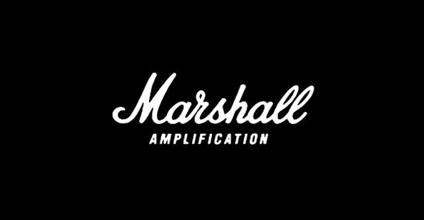
Marshall Amplfication, usually known by just Marshall, is a company that specializes in guitar amps and heads. They are some of the most well known and highly regarded guitar amps of all time. The logo is fairly simply, with only lettering and fonts to distinguish the logo. First off, we see that the word “Marshall” is written in white letters in a cursive font. Sometimes the logo will be in black letters, but it is white when printed on the guitar amps in order to contrast the black color of the amps. The reasoning for the cursive font perhaps could be because Marshall is a company that has been around for a while, so there was no need to have a more eye catching logo to stand out against the competition. However, over time as Marshall has grown in reputation, the cursive letters help to give a feel of heritage and age to the company that a more modern logo would lack. Additionally, in some iterations of the logo, we see that the word “amplification” is written underneath the logo. This is so people can know what kind of company it is just by viewing the logo. By seeing the word under the logo, it is obviously that Marshall creates amps.
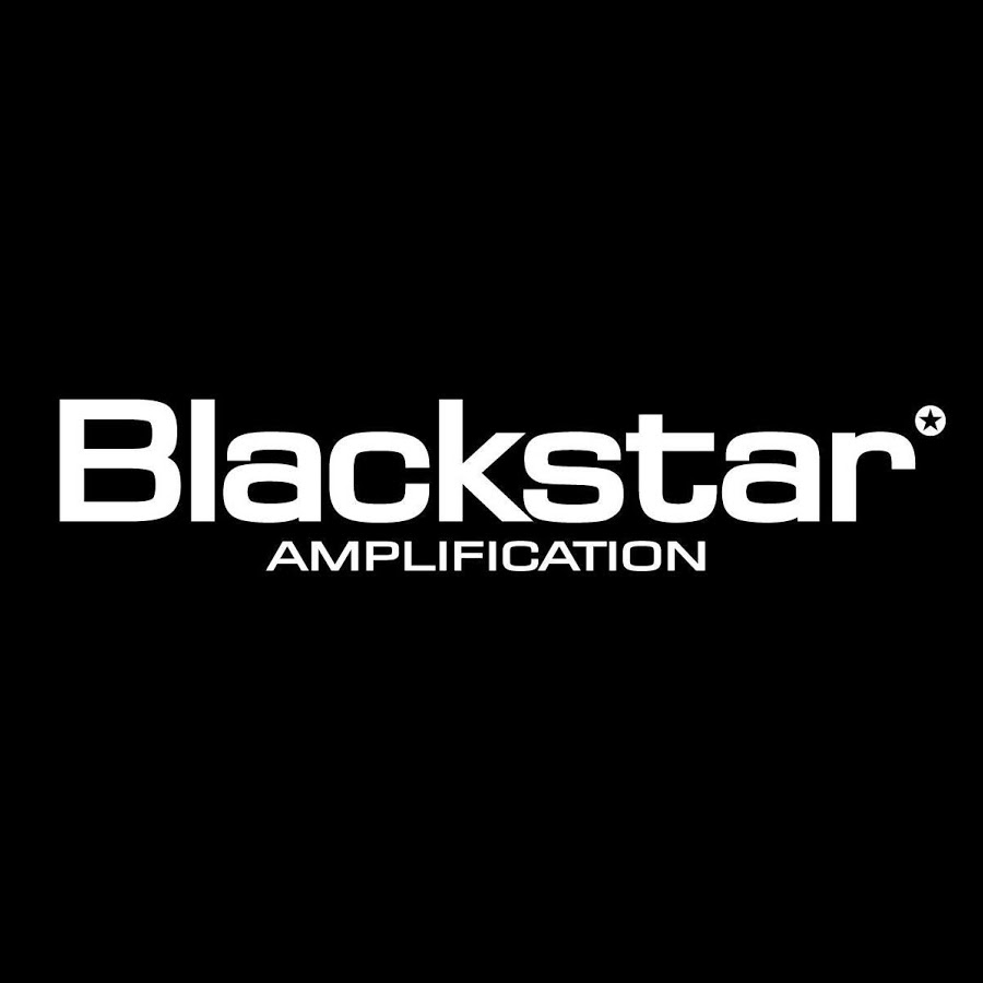
Blackstar Amplification is one of Marshall’s competitors within the market of guitar amps. We see that the logo is much sharper in font and gives a more mordern feel as opposed to the aged look of Marhsall’s logo
Describe the target market (ie. what segments are being targeted)? How do you know this is the target market? Did the company make good decisions to reach the target market?
The target market of Marshall Amplification is guitarists or bassist who are in the market for an amp. Typically, people who use Marshall amps have an appreciation for the history and heritage behind the company. There is even often a status associated with the use of Marshall amps. By keeping a simple timeless logo that is instantly recognizable by most guitarist, Marshall is able to have one of the most iconic logos within the guitar world. I believe that Marshall made a good decision with the use of this logo as it not only has history associated with it, but also is highly recognizable and loved by many guitarists within their target market.
Does it work? Why or why not? Any general observations?
I believe that the logo acomplishes exactly what it needs to. Not only has it become a respectable and inconic symbol in the music world, but it also is easily recognizable. Both of these things help contribute toward the brand’s positive perception. Ultimately, this will lead to higher perceived value by customers and has the potential to increase sales. This is a great example of how something as simple of a logo can help to increase the amount of money a company makes.
