If it’s a store layout:
- Describe in detail the servisescape. Why did they select this specific layout, color scheme, etc.? What does it convey to the consumer? How does it align with their brand perception?
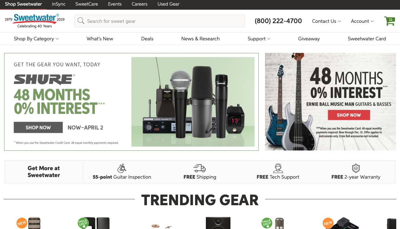
This is not necessarily a store layout, but rather a website layout. However, many of the same concepts of marketing apply. Sweetwater is a large online retailer of musical instruments and accessories. Basically, it’s a Guitar Center competitor, but strictly online (minus their headquarters). Their website is very simple with large links to the main categories of their shop. We also see that the majority of the home page is filled with promotional images such as sales, new products, free shipping, and other information. This is to incentivize customers to look at and purchase the product that are being displayed. We also see that the whole background is white in order to increase contrast and make the images and words on the website stand out. By doing this, Sweetwater furthermore increases the simplicity of their website and allows customers to easily find their way around the website. Simplicity and ease is key with any online store, as customers want the process of shopping to be as easy and intuitive as possible.
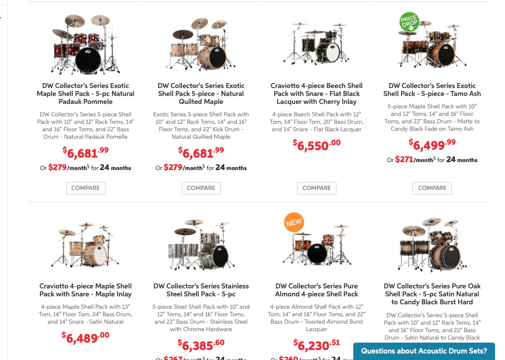
When you go a category to shop for instruments, such as drums as shown in the photo above, we see that the products show up in a well organized scrollable format. The price is shown in large red letters to draw your attention to the price easily. Above the price, we see a small bit of information on each product. This allows the costumers to browse through all the drums and get an understanding about the product. If they choose to, customers can click on a specific product and then see more detailed information about the drums. This concept of easy browsing and navigation around the website helps to make customers spend as much time as possible on the website and hopefully (for the company’s sake, not the customer’s wallet) purchase a product.
- Describe the target market (ie. what segments are being targeted)? How do you know this is the target market? Did the company make good decisions to reach the target market?
The target markets of Sweetwater are musicians or people in need of musical equipment who are in search for an instrument or musical product. This is evident by the fact that Sweetwater is a company exclusive to the music industry. I think the company made a good choice by making their website layout simple and easy to use. In my opinion, I think the website could actually benefit from a redesign with a more modern look and possible better colors (the red white and blue main color layout seems a little old school and plain). Nonetheless, the website still does a great job at fulfilling the ultimate goal of Sweetwater’s website; selling products.
- Does it work? Why or why not? Any general observations?
I believe the layout works very well. The browsing experience is easy and enjoyable, making customers feel comfortable finding and buying what they are looking for. Additionally, the promotional images and information may even convince a costumer to buy a product on which they were not planning. Both of these outcomes are beneficial for Sweetwater as it increases business and revenue. Personally, I find that using Sweetwater is always a good experience thanks to the simplicity and user friendly aspects of the website layout.
