
If it’s a brand logo (design):
- Describe in detail the image, and why you believe the company selected the brand elements (color, size, layout, character, etc.) that they did. Your analysis should include a brief description of the competitors and how your selected brand logo compares. In other words, why did they choose the brand elements that they did.
UltimateGuitar.com, or Ultimate Guitar, is an online website that has over 1 million guitar tabs (an easier alternative to sheet music) and chord charts for almost every song that you can think of. Most tabs are free, and the majority of the brand’s income comes from ads within the website. Guitarists use these tabs and chord charts to learn their favorite songs and guitar parts. The logo for Ultimate Guitar is a very cool logo that does a great job representing what the website is. First off, we notice that the background is in the shape of a yellow guitar pick. This helps to instantly show, even to people that are not familiar with the brand, that the logo is guitar related. Also, yellow is associated with creativity, which makes sense seeing as how musical instruments require creativity. We then see a letter “G” standing for guitar to further convey the message of being guitar related. One of my favorite parts of this logo is that the “G” is not just a plain “G”, rather, it is sharp and angular to give a sort of rock and roll vibe often associated with guitar. Further more, the “G” in the logo has horns on it that make the “G” look uncoincidentally like a “rock on” hand gesture. Just from browsing the home page of Ultimate Guitar, I noticed that the genre of rock has drastically more number of tabs and chords than any other genre. It would make sense that Ultimate Guitar has their logo cater to the largest target market of their customers, being rock guitarists.
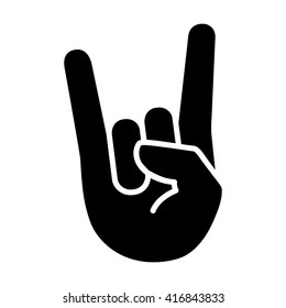
In the image above, we can see that the “rock on” hand gesture shares similarities to the Ultimate Guitar logo.
- Describe the target market (ie. what segments are being targeted)? How do you know this is the target market? Did the company make good decisions to reach the target market?
The target market of Ultimate Guitar is guitar players who are looking for an online community to find tabs or like minded guitarists to discuss guitar related topics on the forums. As mentioned before, it looks that in particular, Ultimate Guitar is targeting especially rock guitarists. Of course there are tabs for all genres, but rock seems to be the focus. This being said, I believe that the company made a great decision on designing their logo by incorporating both a guitar pick and a clever nod to the classic “rock on” hand gesture heavily associated with rock. All of these aspects combined help to create a great logo that perfectly suits the brand and its audience.
- Does it work? Why or why not? Any general observations?
It is always hard to tell if a logo is “working” or not. However, what I am certain of is that the logo does a great job of communicating what type of website it is without the use of even a single word. Even to guitarists who are completely unfamiliar with the website, if they see the logo, they will most likely know that it is a guitar related website, which in turn could draw more traffic to the website out of curiosity and therefore increase the user base.
